AFFMY.COM
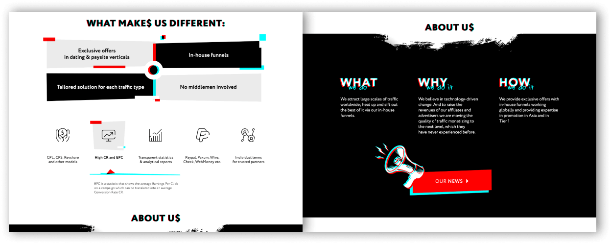
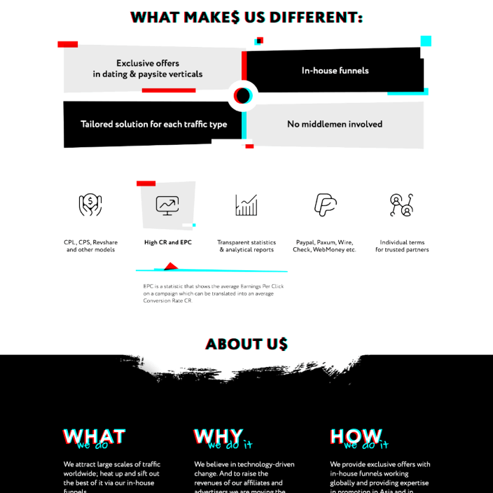
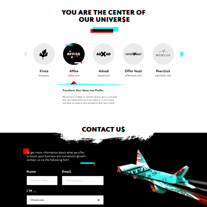
Affmy, a CPA network, reached out to us with a non-trivial task. The objective was to create a website that would significantly stand out among other CPA networks, which, in fact, are all quite diverse, and some of them are also quite well put together.
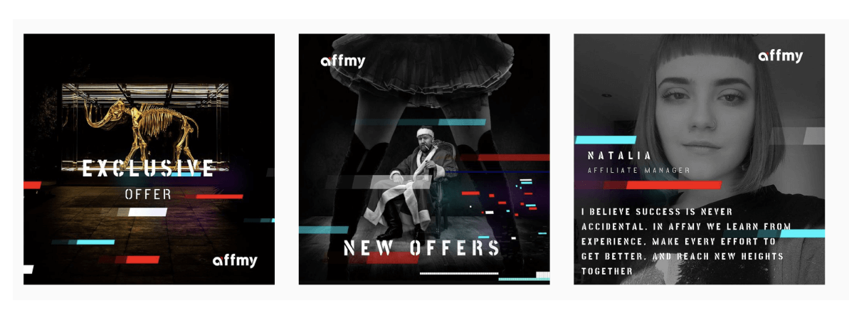
After some intense brainstorming we came to the conclusion that it was necessary to develop the most aggressive and eye-catching visuals, with glitch effects and incredibly bright colors. That is what allowed them to stand out from the competition and become recognizable. The site is perfectly optimized for mobiles/tablets, and looks equally juicy on all available devices. Additionally, all of their promo materials have been designed in blank black color with bright contrasting texts and catchy pictures. As a result, the Affmy network maximally contrasts to others in any forums and meetups.
-
Read more
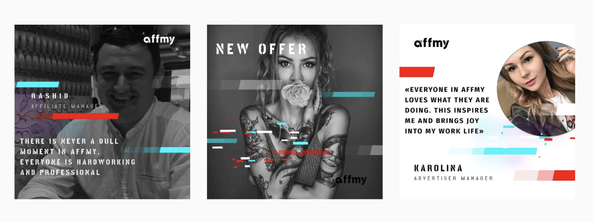
For Affmy, we have also implemented a constructor for social networks. The kit contains: 30 posts for the following month, a large set of icons, effects, pictures and fonts. We created a constructor for each type of post. Now they are able to fill in their social networks with branded content, without any additional costs and literally in a couple of clicks.
-
DoneDesign
- Web-design + adaptive
- SMM pack
- Branding
- Promotional materials
- Frontend+Backend
Links
