adxad.com
ADXAD is an ad network, a large platform that brings together advertisers and publishers. Our task was to visually divide the site into two parts (for publishers and for advertisers), for each user to go his own way and see only the information that was interesting and essential to him.
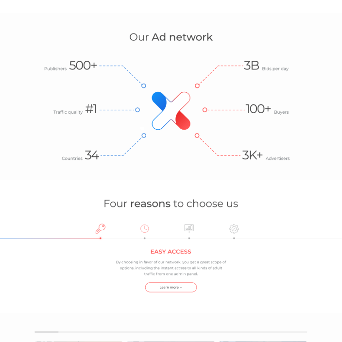
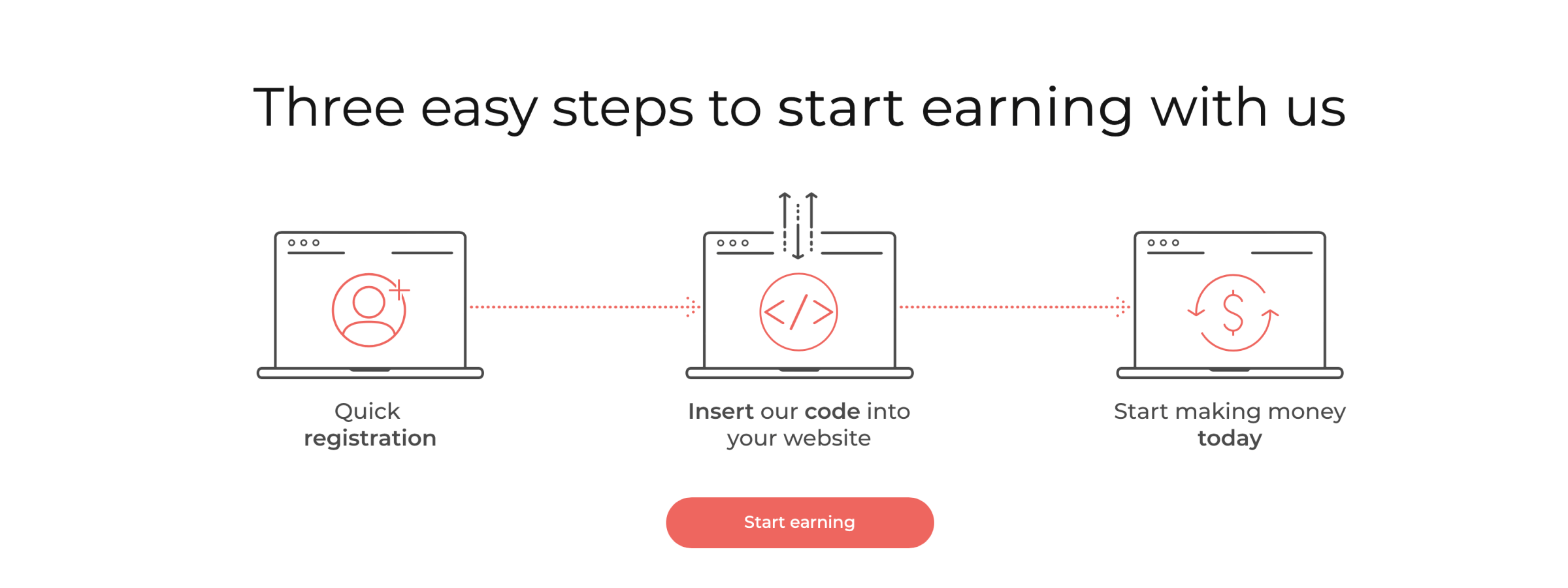
For a better distinction and orientation, it was decided to divide the visual both logically and in color into two parts: red for publishers, blue for advertisers. Therefore, now when a user visits the site, it is perfectly clear where he needs to proceed further. This hierarchy of colors has been kept on all pages of the site, up to the registration. The idea of the central spiral came to us rather spontaneously: since we divide users into 2 categories by color and ADXAD connects them, we implemented two flows from different sides, which intersect in the center and then go their separate ways. The animation has been well optimized: it does not waste resources of users and really looks great on mobile devices.
-
Read more
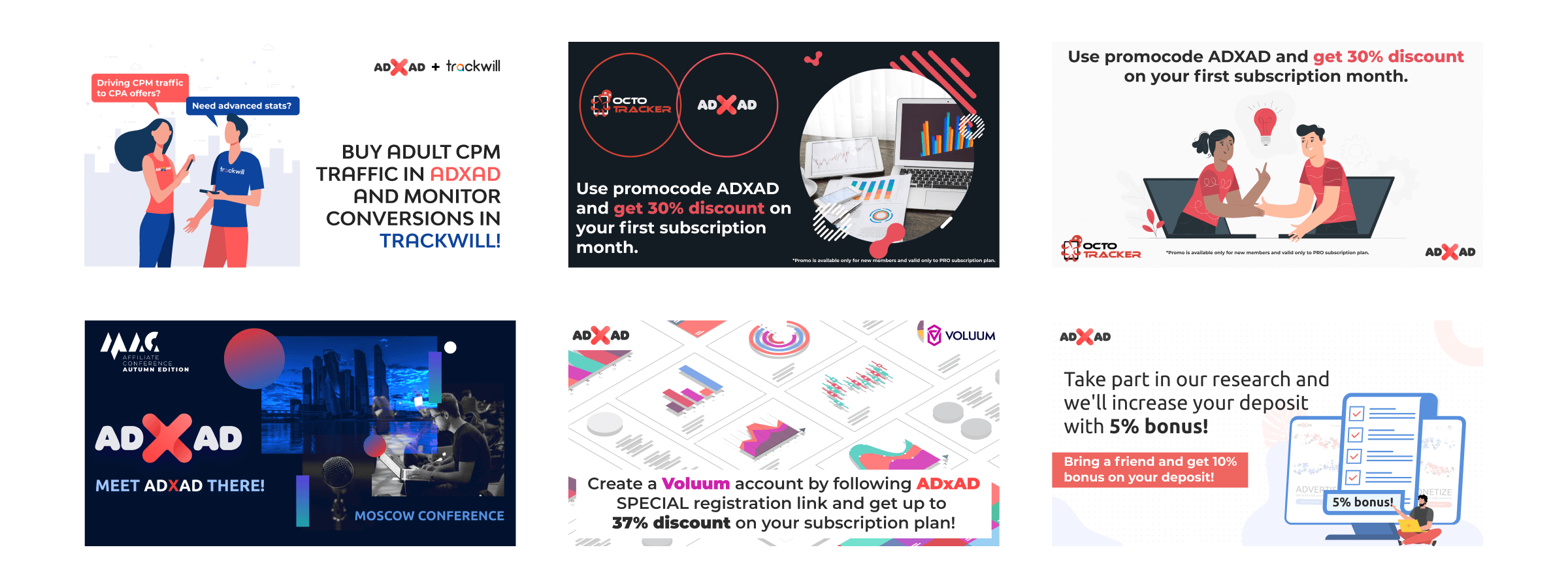
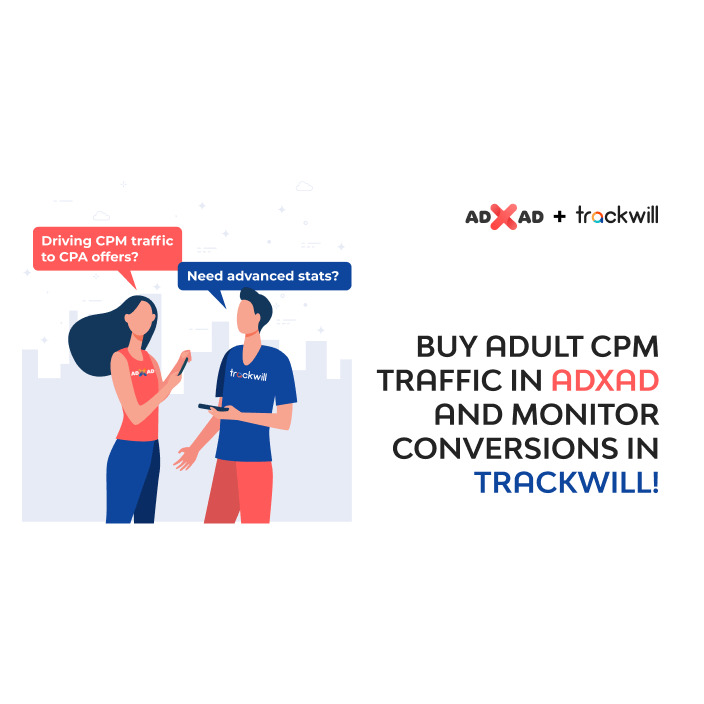
In addition to the website, we also run ADXAD's promotional campaign and do creative writing.
-
DoneDesign
- Web-design + adaptive
- SMM pack
- Branding
- Promotional materials
- Frontend+Backend
Links